```html
What Colours Go With Red Interior Design Ideas?
Red, a colour synonymous with passion, energy, and a commanding presence, can be a powerful tool in interior design. However, due to its intensity, selecting complementary colours is crucial to achieving a balanced and aesthetically pleasing space. The success of red within an interior hinges on understanding its various shades, undertones, and how it interacts with other colours in the spectrum. This article will explore a range of colours that harmonize with red, providing guidance on how to utilize them effectively in different interior design styles.
Understanding the Nuances of Red
Before delving into specific colour pairings, it is essential to recognize that "red" is not a monolithic entity. It exists in a spectrum of shades, each possessing unique characteristics. For instance, a tomato red possesses a brighter, more vibrant quality, while a burgundy leans towards a deeper, more sophisticated feel. Crimson red offers a classic, regal impression, whereas a terracotta has a more earthy, grounded aesthetic. The specific shade of red chosen significantly influences the optimal colour palette.
Furthermore, understanding the undertones of a particular red is crucial. Some reds may have warm undertones, leaning towards orange, while others might possess cooler undertones, edging towards blue or purple. Identifying these undertones ensures that the accompanying colours harmonize effectively, avoiding clashes that could detract from the overall design. This requires careful observation of the red paint sample or fabric in various lighting conditions to accurately discern its underlying hues.
The amount of natural light within a space also plays a significant role in how red is perceived. A room bathed in sunlight will amplify the vibrancy of red, potentially making it appear overwhelming if not balanced correctly. Conversely, in a dimly lit room, a dark red can create a sense of intimacy and drama, but lighter accents are needed to prevent the space from feeling oppressive.
Classic and Timeless Colour Combinations
Several colour pairings with red have proven to be consistently successful throughout various design eras. These combinations offer a reliable foundation for incorporating red into interior spaces, providing a sense of balance and visual appeal.
Red and White: This pairing is a classic for a reason. White acts as a neutral backdrop, allowing the red to stand out without overpowering the space. The contrast between the two colours creates a clean and crisp aesthetic, suitable for a variety of styles, from modern minimalist to traditional farmhouse. The proportion of each colour is crucial; too much red can be overwhelming, while too little may diminish its impact. White can be used on walls, ceilings, and larger furniture pieces, while red can be incorporated through accent pillows, artwork, or smaller furniture items.
Red and Black: This combination exudes sophistication and drama. Black anchors the red, creating a sense of depth and formality. This pairing works particularly well in spaces where a dramatic statement is desired, such as a home theatre or a formal dining room. Similar to red and white, balance is key. Too much black can make the space feel claustrophobic, while too much red can appear garish. Consider using black as an accent colour on furniture frames, lighting fixtures, or architectural details to complement red walls or upholstery.
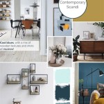
Red and Grey: Grey offers a more subtle and sophisticated alternative to white. It provides a neutral backdrop that softens the intensity of red, creating a more calming and balanced atmosphere. The specific shade of grey chosen can significantly impact the overall feel of the space. Lighter greys create a more airy and modern aesthetic, while darker greys evoke a sense of sophistication and drama. Red can be incorporated as an accent colour through textiles, artwork, or smaller furniture items. The key is to choose a grey with an undertone that complements the red's undertone – cool grey with cool red, warm grey with warm red.
Modern and Contemporary Colour Partnerships
Beyond the classic pairings, numerous modern and contemporary colour combinations can effectively complement red, offering a fresh and innovative approach to interior design.
Red and Teal/Turquoise: These colours create a vibrant and energetic contrast that works well in modern and eclectic spaces. Teal and turquoise, with their cool undertones, balance the warmth of red, preventing it from becoming overwhelming. This combination is particularly effective when used in a space with plenty of natural light. Red can be used as a primary colour on walls or furniture, while teal or turquoise can be incorporated through accent pieces, such as pillows, rugs, or artwork. The key is to maintain a balance between the two colours, preventing either from dominating the space.
Red and Mustard Yellow: This combination offers a warm and inviting aesthetic, reminiscent of autumnal tones. Mustard yellow, with its earthy undertones, complements red beautifully, creating a sense of comfort and sophistication. This pairing works well in living rooms, dining rooms, and bedrooms. Red can be used on walls or as a primary colour in upholstery, while mustard yellow can be incorporated through accent pillows, throws, or artwork. Consider using natural materials, such as wood and leather, to further enhance the warmth of this colour palette.
Red and Olive Green: Olive green provides a grounding and calming contrast to the boldness of red. This pairing evokes a sense of nature and tranquility, making it suitable for spaces where relaxation is desired. This combination works particularly well in bedrooms, living rooms, and studies. Red can be used as an accent colour on furniture, textiles, or artwork, while olive green can be used on walls or as a primary colour in upholstery. Incorporating natural elements, such as plants and wood furniture, can further enhance the organic feel of this colour scheme.
Unexpected and Bold Colour Accents
For those seeking a more daring and unconventional approach, several unexpected colour accents can effectively complement red, creating a unique and memorable interior space.
Metallic Accents (Gold, Silver, Copper): Metallic accents can add a touch of glamour and sophistication to a space dominated by red. Gold enhances the warmth of red, creating a luxurious and opulent feel, while silver provides a cooler contrast, adding a touch of modernity. Copper offers a more rustic and earthy touch. These metallic accents can be incorporated through lighting fixtures, furniture hardware, decorative objects, or even wallpaper. The key is to use metallic accents sparingly, allowing them to enhance the red without overwhelming the space.
Purple: Pairing red with purple creates a rich and luxurious aesthetic. The combination works particularly well with deeper shades of both colours, such as burgundy and plum. The colours are analogous, meaning they are adjacent to each other on the colour wheel, creating a harmonious, yet bold effect. Purple can be used as an accent colour in textiles, artwork, or accessories, adding depth and dimension to the red-dominated space.
Animal Prints: Incorporating animal prints, such as leopard or zebra, can add a touch of exotic flair to a red interior. These prints introduce texture and visual interest, creating a dynamic and unexpected contrast to the intensity of red. Animal prints can be used sparingly in accent pillows, rugs, or artwork, adding a touch of personality and sophistication to the space.
Ultimately, the best colours to pair with red depend on the desired aesthetic, the specific shade of red being used, and the overall style of the interior. Careful consideration of these factors will ensure a harmonious and visually appealing space.
```
Colours That Go With Red The Best Complementary Match Architecture Design

Rooms With Red Walls Bedroom And Living Room Ideas

10 Tips To Design A Red Living Room

Colours That Go With Red The Best Complementary Match Architecture Design

Red Living Rooms Design Ideas Decorations Photos

50 Energetic And Colorful Living Room Design Ideas Brown Couch Decor Red

10 Tips To Design A Red Living Room

Vibrant Red Raspberry Walls With Contrasting Accents

The Meaning Of Color Red

Colours That Go With Red The Best Complementary Match Architecture Design
Related Posts