Most Popular Interior Paint Colors: A Focus on Neutrals
Neutral interior paint colors remain a perennial favorite for homeowners and designers alike. Their versatility, ability to complement diverse styles, and capacity to create a calming and sophisticated ambiance contribute to their enduring popularity. When selecting a neutral palette, understanding the nuances of each shade and how it interacts with light and other design elements is paramount. This article explores some of the most popular neutral paint colors available, detailing their characteristics and ideal applications.
The Timeless Appeal of Whites
White paint colors are more complex than they initially appear. Numerous shades exist, each possessing subtle undertones that significantly influence the overall feel of a room. While seemingly simple, choosing the right white requires careful consideration of the room's natural light, architectural details, and desired aesthetic. Whites are chosen for their ability to brighten spaces, make them feel larger, and provide a clean, minimalist backdrop for furniture and décor.
Off-whites, such as cream or ivory, introduce warmth to a space and can be particularly effective in rooms with limited natural light. These shades offer a softer alternative to stark white, creating a cozy and inviting atmosphere. Cooler whites, with hints of gray or blue, project a more modern and sophisticated feel, suitable for contemporary interiors. It is crucial to sample different white paint colors in the specific room they will be used in, observing how they look at different times of the day and under various lighting conditions. The interplay of light and undertones is what ultimately determines the success of a white paint selection.
Another important factor is the paint's finish. Matte finishes are ideal for hiding imperfections, while eggshell and satin finishes offer durability and are easier to clean. Semi-gloss and gloss finishes are typically reserved for trim and doors, providing a subtle sheen and added protection against wear and tear.
The Versatility of Grays
Gray paint colors have surged in popularity over the past decade and continue to be a staple in contemporary design. Gray's versatility stems from its ability to act as both a primary wall color and a sophisticated neutral backdrop. Much like white, gray encompasses a wide spectrum of shades, ranging from light and airy to deep and dramatic. Its neutral nature allows it to pair well with a multitude of colors, making it an excellent choice for creating balanced and visually appealing spaces.
Light grays, such as "greige" (a blend of gray and beige), offer a warm and inviting ambiance, suitable for living rooms and bedrooms. Greige tones often have subtle earthy undertones, providing a grounding effect in a space. These colors work well with natural materials like wood and stone, creating a harmonious and organic feel. Deeper grays, such as charcoal or slate, can add a touch of drama and sophistication to dining rooms or accent walls. These darker shades are particularly effective in rooms with ample natural light, preventing them from feeling too enclosed.
The undertones in gray paint colors are crucial to consider. Some grays may have blue or purple undertones, which can create a cool and calming atmosphere, while others may have green or brown undertones, adding warmth and earthiness. Careful examination of these undertones is essential to ensure the gray complements the existing décor and desired aesthetic. Gray paint colors are also influenced by the room's lighting. Artificial lighting can drastically alter the appearance of gray, so it's important to test different shades under both natural and artificial light.
Gray paint also serves as a canvas for bold accent colors. Against a gray backdrop, vibrant colors like teal, yellow, or red will stand out, creating visual interest. This makes gray an excellent choice for those who want a neutral foundation while still incorporating pops of color into their interior design.
The Enduring Elegance of Beige and Taupe
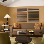
Beige and taupe represent classic neutral choices, offering warmth and sophistication that have stood the test of time. These colors provide a comforting and inviting atmosphere, making them well-suited for living rooms, bedrooms, and kitchens. Beige, with its warm undertones, brings a sense of coziness and familiarity to a space. Taupe, a blend of brown and gray, offers a more refined and elegant feel, suitable for creating a sophisticated and timeless aesthetic.
The selection of beige and taupe shades requires careful consideration of the existing décor and desired mood. Lighter beiges can create a bright and airy feel, while darker beiges add a sense of depth and richness. Similarly, light taupes provide a subtle and elegant backdrop, while darker taupes offer a more dramatic and grounding effect. When pairing beige and taupe with other colors, it's important to consider the undertones. Warm beiges work well with earthy tones, such as greens and browns, while cooler taupes complement blues and grays.
Similar to white and gray, beige and taupe paint colors are also affected by lighting. Natural light can enhance the warmth of these colors, while artificial light can alter their appearance. It's essential to test different shades under various lighting conditions to ensure the chosen color achieves the desired effect. Beige and taupe are often used in traditional and transitional interior design styles, but they can also be incorporated into more modern spaces with careful consideration of the furniture and décor. Opting for clean lines and minimalist accessories can help prevent beige and taupe from feeling outdated.
Beige and taupe are also excellent choices for highlighting architectural details. When applied to walls with intricate moldings or wainscoting, these colors can accentuate the beauty of the architectural features, adding depth and character to a room. Their understated elegance makes them a versatile choice for creating a cohesive and harmonious interior design scheme.
Utilizing Neutrals to Influence Space Perception
Beyond their individual characteristics, neutral paint colors can be strategically employed to manipulate the perception of space. Lighter neutrals, such as whites and light grays, reflect light and can make a small room feel larger and more open. Conversely, darker neutrals, such as deep grays or browns, can add depth and intimacy to a large room, making it feel more cozy and inviting.
The use of a single neutral color throughout an entire home can create a sense of flow and continuity, making the space feel more cohesive and unified. This is particularly effective in open-concept living areas, where a consistent color palette can help to define different zones without visually fragmenting the space. Alternatively, using different shades of the same neutral color can add subtle variations and visual interest while maintaining a harmonious overall aesthetic. For example, using a lighter shade of gray in the living room and a darker shade of gray in the dining room can create a subtle distinction between the two spaces while still adhering to a cohesive color scheme.
Neutrals also serve as a valuable tool for balancing the colors in a room. If a room is dominated by bold or vibrant colors in the furniture or décor, using a neutral paint color on the walls can help to tone down the overall intensity and create a more balanced and harmonious space. This is particularly important in rooms where strong patterns or textures are present, as a neutral backdrop will prevent the space from feeling visually overwhelming.
Furthermore, neutral paint colors can be used to highlight specific architectural features or design elements. By painting a wall behind a prominent piece of artwork or a striking fireplace with a contrasting neutral color, the eye will be drawn to that focal point, enhancing its visual impact. This technique can be used to create a sense of drama and sophistication in a room, drawing attention to the most important design elements.
In conclusion, the selection of neutral interior paint colors requires careful consideration of the room's lighting, architectural details, existing décor, and desired aesthetic. By understanding the nuances of each shade and how it interacts with other design elements, homeowners and designers can create spaces that are both visually appealing and functionally harmonious.

The Best Neutral Paint Colors Midwest Life And Style Blog

20 Best Neutral Paint Colors West Magnolia Charm

A Word About Neutrals Colorfully Behr Blog

Sherwin Williams 6 Best Neutral Beige Paint Colors With A Bit More Depth Kylie M Interiors

The Best 15 Neutral Paint Colors For 2024 Turquoise Home

My Top 20 Favorite Neutral Paint Colors Jess Klein Studio

Sherwin Williams 6 Best Neutral Beige Paint Colors With A Bit More Depth Kylie M Interiors

The Best Sherwin Williams Neutral Paint Colors

The Best Neutral Paint Colors For Home Love Remodeled

Top 10 Most Popular Neutral Paint Colors 2024 Agape Home Services
Related Posts