Modern Interior Design Color Palettes: A Comprehensive Guide
Modern interior design prioritizes clean lines, functionality, and a sophisticated aesthetic. Color plays a crucial role in achieving this, influencing the mood, perception of space, and overall harmony of a room. Selecting the right color palette is therefore a fundamental step in any modern interior design project. This article explores key considerations for modern interior design color palettes, examining popular schemes and offering practical advice for implementation.
Understanding the principles of color theory is essential before diving into specific palettes. Color theory explores the relationships between colors, including primary, secondary, and tertiary hues. Concepts like complementary colors (opposites on the color wheel), analogous colors (adjacent on the color wheel), and monochromatic schemes (variations of a single color) provide a framework for creating balanced and visually appealing spaces. Moreover, understanding the psychological impact of colors is significant. For instance, blues and greens are often associated with tranquility and serenity, while reds and oranges evoke energy and excitement. Careful consideration of these factors is crucial for creating a space that aligns with its intended function and the desired atmosphere.
Modern design often favors a restrained and curated approach to color. This doesn't necessarily mean limiting oneself to entirely neutral schemes, but rather using color strategically to create visual interest and highlight key architectural features or design elements. Consider the existing context of the space, including natural light, architectural style, and existing furnishings. The goal is to create a cohesive and harmonious environment where color enhances, rather than overwhelms, the overall design.
Neutral Foundations with Strategic Accents
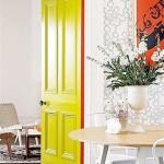
One of the most prevalent approaches in modern interior design is establishing a neutral base palette and then incorporating pops of color through accessories, art, or accent walls. This allows for flexibility and easy adaptation as tastes evolve. Popular neutral colors include shades of white, gray, beige, and greige (a blend of gray and beige). These colors provide a calming and sophisticated backdrop that allows bolder colors to stand out without creating visual chaos.
White, in its various shades from crisp and bright to warm and creamy, is a timeless choice for modern interiors. It creates a sense of spaciousness and reflects light effectively, making it ideal for smaller spaces or rooms with limited natural light. Gray, another versatile neutral, offers a more sophisticated and grounded feel. Lighter grays can create a soft and airy atmosphere, while darker grays provide a sense of drama and depth. Beige and greige offer warmth and comfort, providing a more inviting alternative to stark white or cold gray. These neutral tones work well with natural materials like wood and stone, creating a sense of organic elegance.
When selecting accent colors, consider the overall mood and function of the space. For a living room, warm tones like terracotta, mustard yellow, or rusty orange can create a cozy and inviting atmosphere. For a bedroom, cool tones like teal, dusty rose, or lavender can promote relaxation and tranquility. Introduce these accent colors through throw pillows, blankets, rugs, artwork, or even a statement piece of furniture. The key is to use them sparingly and strategically to create visual interest without overwhelming the neutral base.
The use of metallics, such as gold, silver, or copper, can also add a touch of sophistication and glamour to a neutral palette. These can be incorporated through lighting fixtures, hardware, or decorative accessories. However, it’s crucial to use metallics judiciously to avoid creating a gaudy or overly ornate effect. A few well-placed metallic accents can elevate the overall design and add a touch of luxury.
Monochromatic Harmony
A monochromatic color scheme involves using different shades, tints, and tones of a single color throughout a space. This creates a sense of unity, serenity, and sophistication. While it might seem limiting, a monochromatic palette can be surprisingly versatile and visually interesting when executed effectively.
The key to a successful monochromatic scheme is to vary the hues and textures within the chosen color family. For instance, a blue monochromatic palette could include navy blue, sky blue, and various shades of teal and turquoise. Incorporating different textures, such as velvet, linen, and wood, can also add visual interest and depth. A monochromatic scheme does not necessarily mean that everything in the room has to be the same color; instead, it means building the room around one central color hue, using a family of tones to build the space.
When selecting a color for a monochromatic scheme, consider the overall mood and function of the space. For a bedroom, a soft and calming color like lavender or sage green can create a relaxing atmosphere. For a living room, a more vibrant color like emerald green or deep teal can add a touch of drama and sophistication. It is important to ensure that the color chosen is one that is lived in, and not purely decorative.
To prevent a monochromatic scheme from feeling monotonous, introduce contrasting elements through texture or pattern. A patterned rug, a textured wall covering, or a piece of artwork with subtle variations in color can add visual interest and prevent the space from feeling flat. The contrasting elements should not overpower the central hue, but should work on the same plane, existing to support and enhance the main colour.
Lighting is a key consideration in a monochromatic scheme. Different types of lighting can affect how the color is perceived, so it is important to experiment with different lighting options to find what works best in the space. Layering light allows you to add depth, shadow, and texture through the manipulation of warm and cool tones. Different shades of lighting can influence the overall perceived shade of the walls, fabrics and furniture, meaning that each object can appear to be a different shade of the selected colour.
Bold Color Statements
While neutral palettes dominate many modern interiors, bold color statements are also increasingly prevalent. This involves using saturated colors to create a dramatic and eye-catching effect. However, it's essential to approach bold colors with caution and careful planning to avoid creating a space that feels overwhelming or visually chaotic.
When using bold colors, consider limiting them to a single accent wall or a few key pieces of furniture. This allows the color to make a statement without dominating the entire space. For example, a single wall painted in a vibrant teal or a statement sofa in a bold mustard yellow can add personality and visual interest to an otherwise neutral room.
Pair bold colors with neutral tones to create balance and contrast. A bright orange accent wall can be balanced by white walls and neutral furniture. A deep purple sofa can be paired with gray flooring and light-colored accessories. This creates a visually appealing contrast that prevents the bold color from feeling overwhelming.
Consider the inherent qualities of the chosen bold color. Some colors are inherently more stimulating, such as bright reds and yellows, while others are more calming, such as deep blues and greens. The choice of color should align with the intended function of the space. A vibrant red might be appropriate for a home office or gym, while a calming blue would be more suitable for a bedroom or bathroom.
Natural light plays a significant role in how bold colors are perceived. Colors can appear more intense in natural light and more muted in artificial light. It is important to consider the amount of natural light in the space when selecting a bold color to ensure that it does not appear too overwhelming or dull. Consider the shade of lightbulbs. Bright white lights will amplify the colour, whereas warm yellow lighting will tone it down and make it more muted.
Ultimately, selecting a modern interior design color palette is a matter of taste, function, and careful consideration of the existing space. By understanding the principles of color theory, exploring different color schemes, and carefully considering the role of lighting and texture, it is possible to create a space that is both visually appealing and functionally appropriate.

Power Of Color Palettes In Interior Design

20 Best Home Color Palettes House Schemes Offeo

Power Of Color Palettes In Interior Design

Color Palette For Home 12 Combos Designers Love Havenly Interior Design Blog

Color Palette For Home 12 Combos Designers Love Havenly Interior Design Blog

Modern Design Style Paint Colors

Contemporary Interior Room Paint Palette Modern Color Collection Decor For Whole Home

How To Create A Color Palette For Your Room

Modern Minimalist Color Palette Sherwin Williams Scandinavian Inspired Interior Design Home Paint Scheme For Walls Cabinets And Rooms

Color Palette By Paleutr
Related Posts