Contemporary Interior Design: Navigating Modern Color Schemes
Contemporary interior design is a dynamic and evolving style that reflects current trends while maintaining a timeless appeal. Unlike modern design, which is rooted in a specific historical period, contemporary design is fluid and adaptable, drawing inspiration from various sources. A crucial element in achieving a successful contemporary interior is the deliberate and thoughtful selection of color schemes. Color significantly influences the overall aesthetic, mood, and spatial perception of a room. Understanding the nuances of color theory and how it applies to contemporary design principles is essential for creating visually appealing and functional spaces.
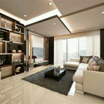
Contemporary color schemes often deviate from rigid rules, embracing experimentation and individuality. However, certain underlying principles guide the selection process. Neutral backdrops, such as greys, beiges, and off-whites, are frequently used to provide a foundation upon which to build more vibrant accents. This allows for flexibility in incorporating bolder colors through furniture, artwork, and accessories. The key is to create a balanced and harmonious composition that avoids overwhelming the space. The interplay of light and shadow also plays a significant role in how colors are perceived, so considering the natural and artificial lighting conditions is crucial during the planning phase.
The specific color palette chosen depends on the desired atmosphere and the function of the room. A living room might benefit from warmer tones that promote relaxation and social interaction, while a home office might require cooler, more focused colors that enhance productivity. The size and layout of the space also factor into the decision-making process. Smaller rooms may benefit from lighter colors that create an illusion of spaciousness, while larger rooms can accommodate bolder, more saturated colors without feeling cramped.
Understanding the Role of Neutrals
Neutral colors are the cornerstone of many contemporary interior designs. They provide a calming and sophisticated backdrop that allows other design elements to shine. However, the term "neutral" encompasses a broad spectrum of shades, each with its own distinct character. Cool neutrals like greys and off-whites create a sense of serenity and sophistication, while warm neutrals like beiges and creams evoke a feeling of comfort and warmth. The choice of neutral will significantly impact the overall mood of the room.
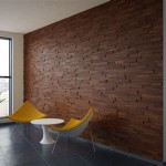
Grey has become a particularly popular neutral in contemporary interiors. Its versatility allows it to be paired with a wide range of accent colors, from bright pops of primary colors to muted earth tones. Different shades of grey can create vastly different effects. Light greys provide a clean and airy feel, while darker greys add depth and drama. The undertones of the grey are also important to consider. Some greys have cool blue undertones, while others have warm beige undertones. Selecting the right grey with the appropriate undertone is crucial for achieving a cohesive color scheme.
Off-white shades offer a softer alternative to stark white, providing a more inviting and comfortable atmosphere. These hues can range from creamy ivory to pale beige, each adding a subtle warmth to the space. Off-whites are particularly effective in creating a sense of spaciousness and light, making them ideal for smaller rooms or spaces with limited natural light. They also provide a versatile backdrop for showcasing colorful furniture and artwork.
Beige, often considered a timeless classic, offers a warm and grounding neutral option. It provides a sense of stability and comfort, making it well-suited for living rooms and bedrooms. However, beige can sometimes appear dated if not used strategically. To avoid this, it's important to select a beige with a modern undertone and to pair it with contemporary furniture and accessories. Using texture and pattern can also help to elevate the beige and create a more dynamic and visually interesting space.
Incorporating Accent Colors Strategically
Accent colors are used to add visual interest and personality to a contemporary interior. They are typically used sparingly to highlight specific areas or features, such as furniture, artwork, or architectural details. The choice of accent colors should complement the neutral backdrop and reflect the desired aesthetic. It's important to consider the color's saturation and intensity, as well as its psychological effects.
One popular approach is to use a single, bold accent color throughout the space. This creates a sense of cohesion and continuity, drawing the eye from one area to another. For example, a vibrant blue might be used in artwork, throw pillows, and a decorative rug, tying the room together. Alternatively, a monochromatic color scheme can be created by using different shades of the same color, adding depth and visual interest through subtle variations in tone and texture.
Another approach is to use a complementary color scheme, which involves pairing colors that are opposite each other on the color wheel. For example, blue and orange, or yellow and purple. This creates a dynamic and visually stimulating effect. However, it's important to balance the use of complementary colors carefully to avoid overwhelming the space. One color should be dominant, while the other is used as an accent.
Analogous color schemes, which involve using colors that are adjacent to each other on the color wheel, offer a more harmonious and subtle effect. For example, blue, blue-green, and green. This creates a calming and cohesive atmosphere. Analogous colors are often used in bedrooms and other spaces where relaxation is desired.
The placement of accent colors is just as important as the colors themselves. Strategic placement can draw attention to specific features, create focal points, and guide the eye through the space. For example, a brightly colored artwork can be hung on a neutral wall to create a focal point. Or, a colorful throw rug can be used to define a seating area. It is important to consider the scale of the room and the size of the accent pieces when determining their placement.
Exploring Current Color Trends in Contemporary Design
Contemporary interior design is constantly evolving, and color trends reflect these changes. Keeping abreast of these trends can help to create a space that feels fresh and modern. However, it's important to incorporate trends thoughtfully, rather than simply following them blindly. The goal is to create a space that is both stylish and timeless, reflecting personal taste and preferences.
Currently, there is a growing emphasis on natural and earthy tones. These colors evoke a sense of calm and connection to the outdoors, reflecting a desire for balance and tranquility in a fast-paced world. Greens, browns, and terracotta hues are gaining popularity, often paired with natural materials like wood, stone, and linen. These colors create a warm and inviting atmosphere.
Another trend is the use of muted pastels, such as blush pink, sage green, and powder blue. These colors offer a soft and sophisticated alternative to bolder hues, creating a sense of serenity and elegance. They are often used in bedrooms and bathrooms, where a calming atmosphere is desired. These pastels pair well with neutrals such as grey and white, creating a light and airy feel.
Bold jewel tones, such as emerald green, sapphire blue, and ruby red, are also making a comeback. These colors add a touch of luxury and drama to a space, creating a sense of opulence. They are often used in living rooms and dining rooms, where a more formal and sophisticated atmosphere is desired. When using jewel tones, it is important to balance them with neutrals to prevent the space from feeling too overwhelming.
Finally, the use of black as an accent color is gaining popularity. Black adds a sense of sophistication and definition to a space, creating a striking contrast with lighter colors. It can be used in furniture, lighting fixtures, and architectural details to add a touch of drama. However, it is important to use black sparingly, as too much black can make a room feel dark and oppressive.

Color Palette For Home 12 Combos Designers Love Havenly Interior Design Blog

Power Of Color Palettes In Interior Design
:strip_icc()/101912857-2add7c1aecd94670bb5e250ae7bf6138.jpg?strip=all "How To Use Modern Colors For Sophisticated Calming Decor")
How To Use Modern Colors For Sophisticated Calming Decor

Contemporary Interior Room Paint Palette Modern Color Collection Decor For Whole Home

Power Of Color Palettes In Interior Design

Contemporary Paint Color Schemes Benjamin Moore

Modern Design Style Paint Colors

Contemporary Color Palette Sherwin Williams Interior Paint Professional Scheme Selection Design

8 Neutral Color Palettes Designers Swear By Decorilla Interior Design

Ultimate Guide To Modern Interior Design And Academy
Related Posts