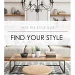
What are the Latest Colours for Interior Design?
The world of interior design is in constant flux, with colour palettes evolving alongside societal trends, technological advancements, and a renewed focus on sustainability. Understanding the latest colour trends is crucial for designers, homeowners, and anyone seeking to create spaces that feel contemporary, inviting, and reflective of current tastes. Colours are not merely aesthetic choices; they influence mood, perception of space, and the overall atmosphere of a room. Current trends indicate a shift towards palettes that are mindful, comforting, and connected to the natural world.
Predicting and identifying these trends is a multifaceted process. Interior design professionals draw inspiration from various sources, including fashion, art, architecture, and global events. Colour forecasting agencies, such as Pantone and WGSN, conduct extensive research to anticipate consumer preferences and identify emerging colour families. These forecasts often serve as a starting point for designers and manufacturers, influencing the colours of furniture, textiles, paint, and accessories.
Several factors contribute to the prominence of specific colours in interior design. The desire for comfort and security, particularly in the wake of global uncertainties, has led to an increased interest in warm, grounding tones. The growing awareness of environmental issues has fueled the popularity of natural and earthy colours. The need for spaces that promote well-being and productivity has influenced the selection of calming and energizing shades. The rise of remote work has also influenced colour choices, pushing for home environments that balance functionality with comfort.
Embracing Earth Tones and Nature-Inspired Palettes
One of the most significant trends in interior design colour is the embrace of earth tones and nature-inspired palettes. These colours evoke feelings of warmth, stability, and connection to the outdoors. The shift reflects a desire for spaces that are calming and restorative, offering a respite from the fast-paced nature of modern life. These palettes often incorporate a range of colours, from deep browns and greens to lighter beiges and creams, creating a sense of depth and complexity.
Shades of brown are making a significant comeback, moving beyond the dated connotations of decades past. Rich, chocolate browns provide a sense of luxury and grounding, while lighter tans and beiges offer a more neutral and versatile backdrop. These colours can be used effectively on walls, floors, and furniture, creating a cohesive and harmonious space. When using brown, consider adding texture through materials like wood, leather, and natural fibres to prevent the space from feeling flat or monotonous.
Green, in its many variations, remains a popular choice for interior design. From deep forest greens to soft sage and vibrant emerald hues, green provides a sense of freshness and vitality. Green is particularly well-suited for use in bedrooms and living rooms, where it can promote relaxation and a sense of well-being. The colour can also be incorporated through plants and botanical prints, further enhancing the connection to nature.
Earthy reds, such as terracotta and rust, are also gaining traction. These colours offer a warm and inviting alternative to cooler tones, bringing a sense of energy and passion to a space. They pair well with natural materials like wood and stone, creating a rustic and organic feel. These shades can be used as accent colours in smaller spaces, such as bathrooms and hallways, or as a dominant colour in larger rooms, such as living rooms and dining rooms.
The popularity of these earth tones is also fueled by their versatility. They can be combined with a wide range of other colours, from neutrals to bolder accent hues, allowing for a high degree of personalization. They work well in a variety of design styles, from minimalist and modern to traditional and bohemian, making them a safe and adaptable choice for any space.
The Rise of Muted Pastels and Soft Hues
Another key trend in interior design is the rise of muted pastels and soft hues. These colours offer a calming and sophisticated alternative to brighter, more saturated shades. They evoke feelings of serenity, tranquility, and understated elegance, creating spaces that are both inviting and visually appealing. This trend reflects a desire for spaces that are not only aesthetically pleasing but also conducive to relaxation and mental well-being.
Soft pinks, such as blush and dusty rose, continue to be popular choices for bedrooms and living rooms. These colours create a warm and inviting atmosphere, while also adding a touch of femininity. They pair well with neutral colours like white and gray, as well as with metallic accents like gold and copper. When using pink, it is important to choose the right shade to avoid creating a space that feels overly saccharine or childish.
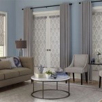
Pale blues, such as sky blue and powder blue, offer a sense of calm and serenity. These colours are particularly well-suited for use in bathrooms and bedrooms, where they can promote relaxation and restful sleep. They also work well in coastal-inspired spaces, where they can evoke the feeling of the ocean and sky. Pale blues can be combined with white, gray, and natural wood tones to create a fresh and airy atmosphere.
Muted greens, such as sage and seafoam green, are also gaining popularity. These colours offer a subtle and sophisticated alternative to brighter greens. They create a calming and natural atmosphere, making them well-suited for use in living rooms, bedrooms, and home offices. They pair well with natural materials like wood and stone, as well as with metallic accents like brass and bronze.
The appeal of muted pastels lies in their versatility. They can be used effectively in a variety of design styles, from minimalist and Scandinavian to traditional and vintage. They also work well in both small and large spaces, creating a sense of openness and airiness. They can be combined with a wide range of other colours, allowing for a high degree of personalization and creativity.
Bold Accents and Unexpected Colour Combinations
While calming neutrals and muted pastels dominate many interior design palettes, there is also a growing trend towards bold accents and unexpected colour combinations. These accents inject personality, energy, and visual interest into a space, preventing it from feeling bland or monotonous. This trend highlights the importance of individuality and self-expression in interior design, allowing homeowners and designers to create spaces that truly reflect their unique tastes.
Jewel tones, such as emerald green, sapphire blue, and ruby red, are making a strong comeback. These colours offer a sense of luxury and sophistication, adding a touch of drama to any space. They work well as accent colours on furniture, textiles, and accessories, providing a striking contrast to neutral backgrounds. Jewel tones can also be used on walls in smaller spaces, such as powder rooms and hallways, to create a sense of opulence.
Unexpected colour combinations are also becoming increasingly popular. Pairing contrasting colours, such as orange and blue or yellow and purple, can create a dynamic and visually stimulating effect. However, it is important to use these combinations carefully, ensuring that the colours complement each other and that the overall effect is balanced and harmonious. Using a colour wheel can be a helpful tool for identifying complementary colours.
Metallic accents, such as gold, silver, and copper, continue to be popular choices for adding a touch of glamour and shine to interior spaces. These accents can be incorporated through lighting fixtures, furniture hardware, and decorative accessories. They pair well with both neutral and bold colours, adding a touch of luxury and sophistication to any room.
The use of bold patterns and textures is also an effective way to add visual interest to a space. Geometric patterns, floral prints, and abstract designs can be used on walls, floors, and textiles to create a sense of movement and depth. Textured materials, such as velvet, linen, and wool, can add tactile interest to a space, making it feel more inviting and comfortable.
The key to incorporating bold accents and unexpected colour combinations is to do so with intention and purpose. It is important to consider the overall aesthetic of the space and to choose colours and patterns that complement the existing design. It is also important to avoid overwhelming the space with too many bold elements, as this can create a chaotic and unsettling effect. Used judiciously, bold accents and unexpected colour combinations can transform a space from ordinary to extraordinary.

5 Interior Design Colour Trends For 2024 Sonigara

Five Colour Trends In Interior Design For 2024 Alma De Luce

5 Interior Design Colour Trends For 2024 Sonigara

Choosing The Right Colours For Interior Design Of Your Home Fineline

Colour Psychology In Interior Design

5 Interior Design Colour Trends For 2024 Sonigara

2024 Interior Colour Trends How To Integrate Into Your Home Hunting For George

Five Colour Trends In Interior Design For 2024 Alma De Luce

Color Palette For Home 12 Combos Designers Love Havenly Interior Design Blog

Color Trends For 2024 A Home Interiors Guide Smart Interior Design Wehouse In
Related Posts