Modern Style Interior Design Color Palette
Modern style, often mistaken for contemporary, is a distinct design movement characterized by its simplicity, functionality, and emphasis on clean lines. Arising in the early to mid-20th century, it rejects ornamentation and embraced industrial materials and technological advancements. A crucial aspect of achieving the desired aesthetic in modern interior design is the careful selection and application of a color palette. The color palette serves not only to visually define the space but also to contribute to the overall feeling of openness, airiness, and sophistication that is central to modern design principles.
The selection of colors should be a deliberate process, considering the architectural features of the space, the amount of natural light available, and the intended use of the room. Understanding the nuances of color theory and how different hues interact with each other is essential for creating a harmonious and visually pleasing modern interior. The goal is to create a balanced and uncluttered environment that promotes a sense of calm and well-being.
Modern design color palettes are generally characterized by a restrained approach, favoring neutral tones as a foundation and incorporating bolder accent colors strategically. This approach ensures that the focus remains on the form and function of the furniture and architectural details, rather than being overwhelmed by excessive color. Furthermore, the careful interplay between light and shadow is a key consideration, as it can dramatically alter the perceived color and texture of surfaces.
Neutral Foundation: The Backbone of Modern Design
Neutral colors form the cornerstone of any successful modern interior. These colors provide a versatile backdrop that allows furniture, artwork, and accessories to take center stage. The most common neutrals used in modern design include: white, off-white, gray, beige, and cream. These colors offer a sense of spaciousness and can reflect light effectively, making smaller rooms feel larger and more open.
White is perhaps the most iconic color in modern design. It is clean, crisp, and visually expanding. Different shades of white, such as bright white, warm white, and off-white, can be used to create subtle variations and add depth to a space. Bright white is ideal for maximizing light and creating a contemporary feel, while warm white offers a softer, more inviting atmosphere. Off-white, with its slight undertones of cream or beige, bridges the gap and provides a subtle warmth.
Gray is another popular choice for modern interiors. It is sophisticated, versatile, and can be used in a variety of shades, from light and airy to dark and dramatic. Light grays offer a similar effect to white, creating a sense of spaciousness and neutrality. Dark grays, on the other hand, can add depth and create a cozy, intimate atmosphere. Gray can also be used to create contrast with white, highlighting architectural features or creating a visual focal point.
Beige and cream provide a warmer alternative to white and gray. These colors offer a sense of comfort and tranquility, making them ideal for bedrooms and living rooms. Beige can range from light tan to deep brown, offering a wide range of options for creating different moods. Cream, with its subtle yellow undertones, adds a touch of warmth and elegance to a space.
When selecting neutral colors, it is important to consider the undertones. Undertones can influence how a color appears in different lighting conditions and how it interacts with other colors in the room. For example, a gray with blue undertones may appear cooler than a gray with yellow undertones. Similarly, a beige with pink undertones may clash with other colors that have green undertones. Testing paint samples in the room before committing to a color is crucial to ensure that the chosen neutral complements the existing elements and creates the desired atmosphere.
Accent Colors: Adding Personality and Visual Interest
While neutral colors provide the foundation for modern design, accent colors are used to add personality, visual interest, and create focal points. Accent colors should be used sparingly and strategically, to avoid overwhelming the space. Common accent colors in modern design include: black, primary colors (red, blue, yellow), and earthy tones (greens, browns, oranges).
Black is a powerful accent color that can add drama and sophistication to a modern interior. It is often used for architectural details, furniture, and accessories. Black can be used to highlight clean lines, create contrast with neutral walls, or add a touch of edginess to a space. When using black, it is important to balance it with lighter colors to prevent the room from feeling too dark or oppressive.
Primary colors, such as red, blue, and yellow, can be used to add pops of color and create a playful, energetic atmosphere. These colors should be used with restraint, as they can easily overwhelm a space. A single piece of furniture, such as a red armchair or a blue rug, can be enough to add a touch of color and create a focal point. Alternatively, small accessories, such as yellow cushions or red artwork, can be used to add subtle accents.
Earthy tones, such as greens, browns, and oranges, can be used to create a sense of warmth, nature, and tranquility. These colors are often inspired by natural elements, such as forests, deserts, and sunsets. Green can be used to bring a touch of the outdoors in, creating a refreshing and calming atmosphere. Brown can be used to add warmth and earthiness, creating a cozy and inviting space. Orange can be used to add energy and vibrancy, creating a cheerful and stimulating atmosphere.
When selecting accent colors, it is important to consider the overall mood and function of the room. For example, a bedroom might benefit from calming colors such as blues and greens, while a living room might benefit from more energetic colors such as reds and oranges. It is also important to consider the existing colors in the room and choose accent colors that complement them. Color wheels and online tools can be helpful in finding harmonious color combinations.
Material and Texture: Enhancing the Color Palette
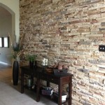
The choice of materials and textures plays a significant role in enhancing the color palette of a modern interior. Different materials and textures can reflect light differently, altering the perceived color and adding depth and dimension to the space. Common materials used in modern design include: wood, metal, glass, concrete, and natural fibers.
Wood is a versatile material that can add warmth, texture, and natural beauty to a modern interior. Different types of wood, such as oak, walnut, and maple, offer different colors and grain patterns. Light-colored woods, such as oak and maple, can be used to create a bright and airy atmosphere, while dark-colored woods, such as walnut, can be used to add drama and sophistication. The texture of wood, whether smooth or rough, can also add visual interest.
Metal, such as stainless steel, chrome, and brass, is often used in modern design for its sleek, industrial aesthetic. Metal can be used for furniture, lighting fixtures, and architectural details. Stainless steel and chrome offer a clean, contemporary look, while brass adds a touch of warmth and elegance. The reflective properties of metal can also enhance the lighting in a room.
Glass is another common material used in modern design, often for windows, doors, and furniture. Glass allows natural light to flow freely, creating a sense of openness and airiness. Transparent glass can be used to create a seamless connection between indoor and outdoor spaces, while frosted glass can be used to provide privacy. Glass furniture, such as coffee tables and shelves, can add a touch of elegance and modernity.
Concrete is a durable and versatile material that can be used for floors, walls, and countertops. Concrete offers a raw, industrial aesthetic that is often associated with modern design. It can be polished to a smooth, glossy finish or left rough for a more textured look. Concrete can also be stained or sealed to change its color and enhance its durability.
Natural fibers, such as wool, cotton, linen, and jute, can be used for rugs, upholstery, and curtains. These materials add texture, warmth, and comfort to a modern interior. Wool is a durable and luxurious material that is ideal for rugs and upholstery. Cotton and linen are lightweight and breathable materials that are ideal for curtains and bedding. Jute is a natural and sustainable material that is ideal for rugs and baskets.
When selecting materials and textures, it is important to consider how they interact with the chosen color palette. Combining smooth and rough textures, matte and glossy finishes, and different materials can add depth and dimension to a space and create a more visually interesting and engaging environment. The interplay between color, material, and texture is crucial to achieving a cohesive and harmonious modern interior.
:strip_icc()/101912857-2add7c1aecd94670bb5e250ae7bf6138.jpg?strip=all "How To Use Modern Colors For Sophisticated Calming Decor")
How To Use Modern Colors For Sophisticated Calming Decor

Modern Design Style Paint Colors

Modern Home Color Palette Interior Paint Pre Selected

20 Best Home Color Palettes House Schemes Offeo

Contemporary Color Palette Benjamin Moore Interior Paint Professional Scheme Selection Design

Color Palette By Paleutr

9 Ways To Incorporate Modern Interior Design Style In Your Home Foyr

Contemporary Paint Color Schemes Benjamin Moore

Color Palette By Paleutr Interior Colorpalette

Modern Rustic Sherwin Williams Interior Paint Palette
Related Posts